How I help

Presentation design & production

I turn existing design concepts into clear, well-structured presentations that are easy to follow and comfortable to present. Whether it’s a pitch, sales deck, or internal presentation, I focus on clarity, consistency, and polish — so the message comes through without distraction.

Typical work includes:

  • Building decks from existing brand or campaign design
  • Cleaning up and restructuring complex presentations
  • Adapting content for different audiences or formats
  • PowerPoint, Google Slides, and Keynote production

Presentation systems & templates

For teams that create presentations regularly, I design templates and slide systems that stay consistent over time. These are built to be flexible, easy to use, and resistant to “design drift” — even when multiple people are editing them.

Typical work includes:

  • Master templates and slide libraries
  • Layout systems for different content types
  • Brand-safe typography, colour, and spacing rules
  • Updating or repairing existing templates

Motion for presentations

When motion adds clarity or emphasis, I design subtle animations that guide attention and support the story — without overwhelming the content. Motion is always used purposefully, whether inside a deck or as part of a presentation video.

Typical work includes:

  • Animated slides and transitions
  • Motion-enhanced key moments in presentations
  • After Effects support for presentation videos or loops
  • Static-to-motion adaptations of existing slides

Due to the nature of much of the in-house and pitch work I do, clients generally ask for their presentations to remain private.

So, to give an idea of the presentations not contained in this portfolio, here are some of the other accounts on which I have worked:

Logos-board_1600
Asahi

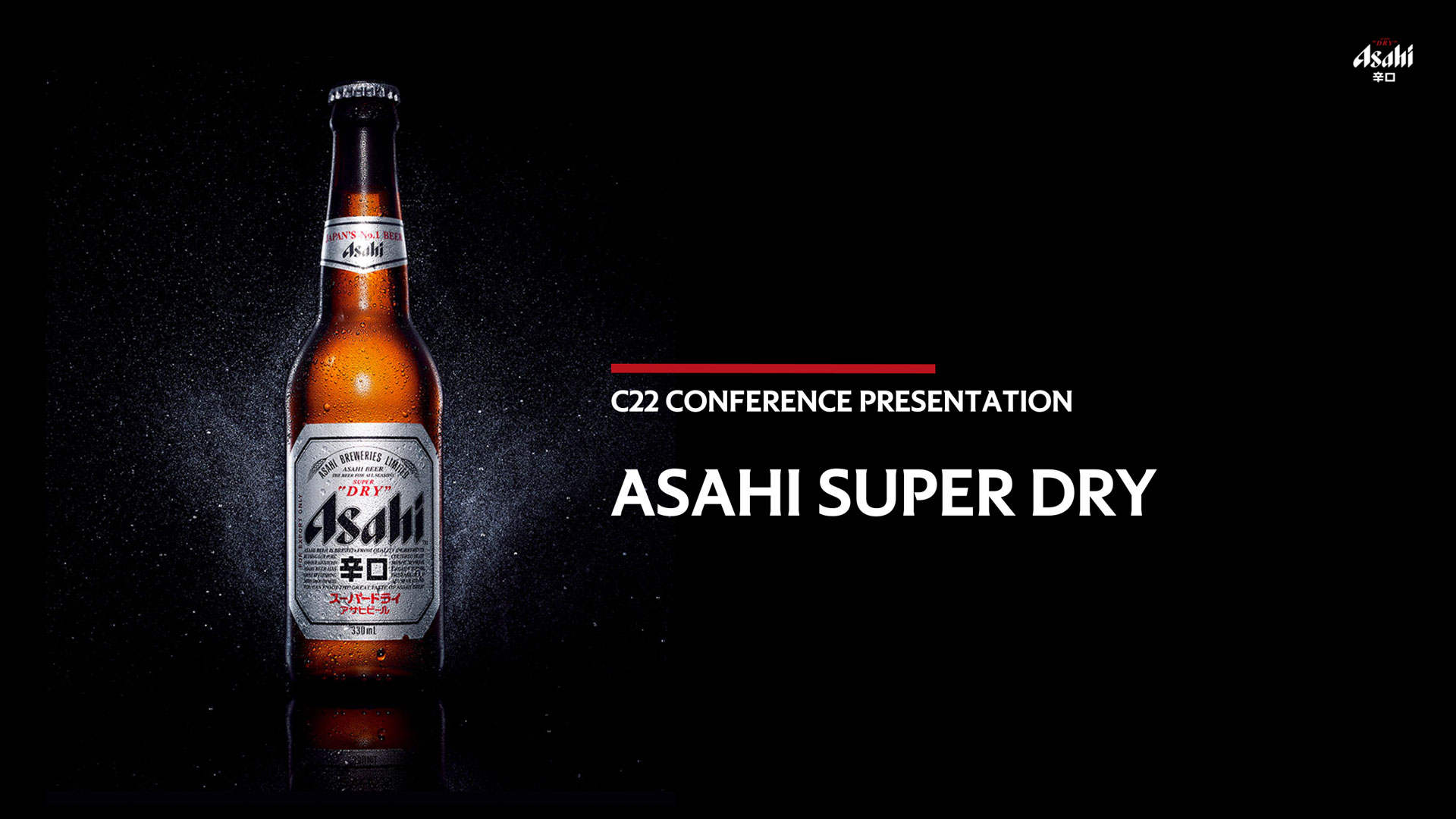
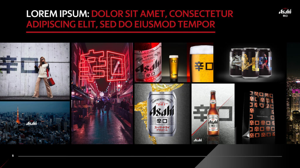
I worked with global creative agency DMB on several content-heavy pitches for Asahi.

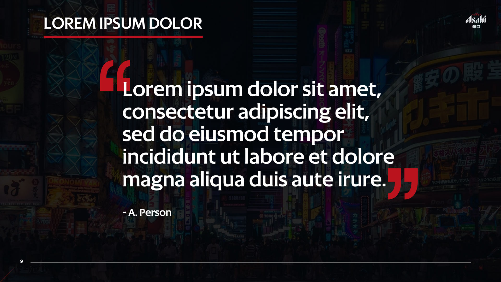
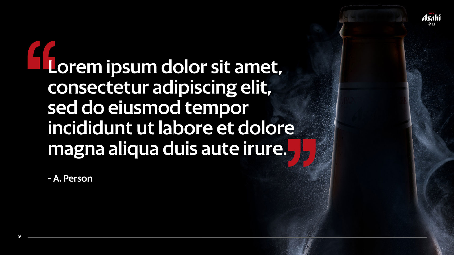
The client was very happy with my aim of creating visually compelling slides, using a mix of their supplied photography and bespoke animations.

The subtle slide shows and parallax effects provided more compelling visual interest than static slides, whilst utilising animation outside of the standard PowerPoint tools and without being distracting.
Parallax effect
Carousel
ExxonMobil / Climalife

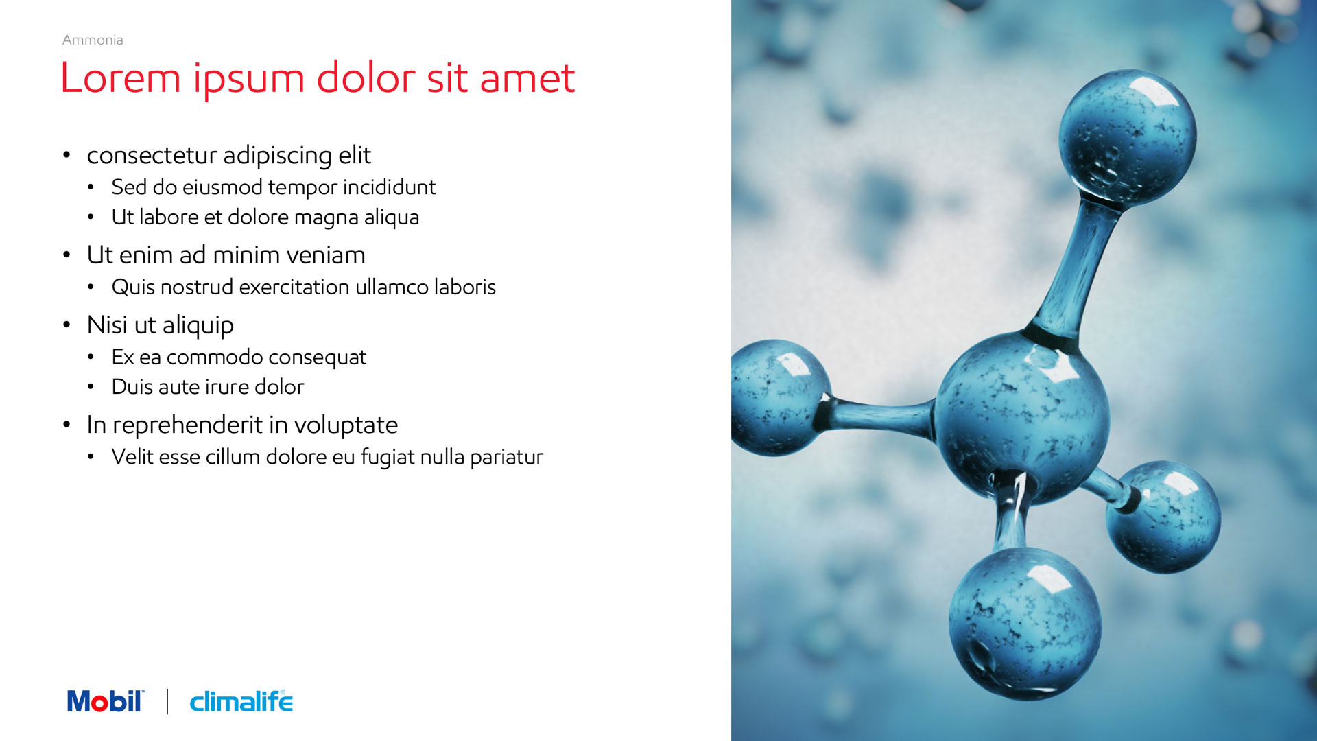
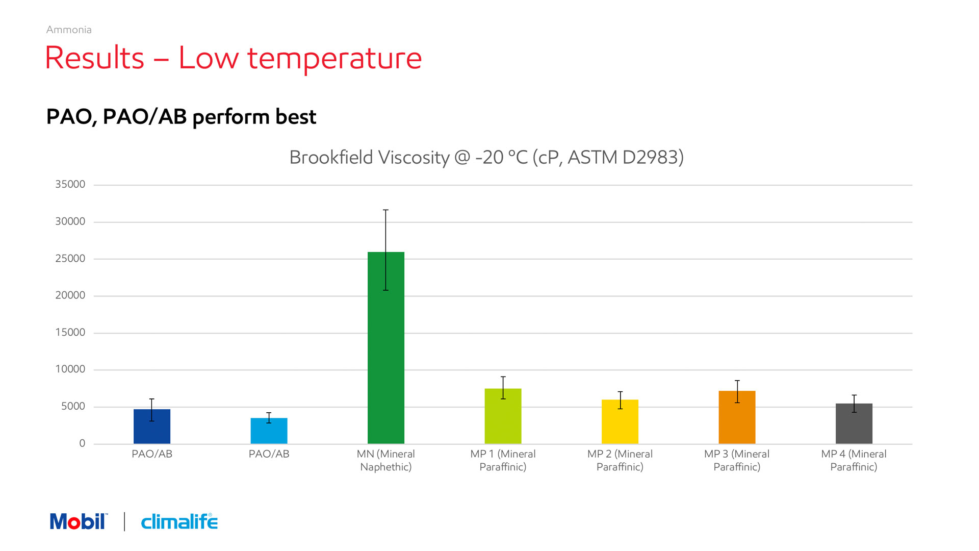
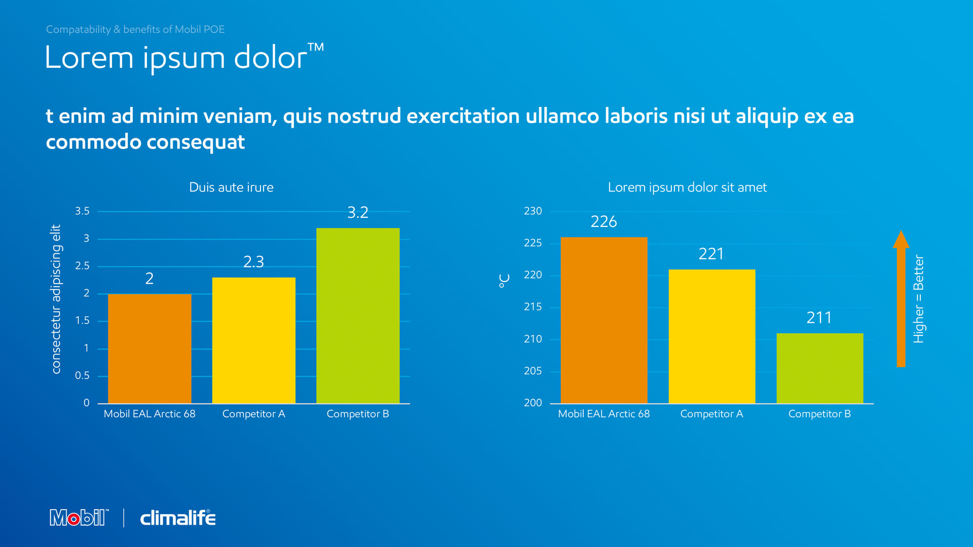
A brand commerce agency asked me to work on a joint presentation for ExxonMobil and Climalife.

Using ExxonMobil’s usual template as a starting point, I was asked to divert from the strict brand guidelines.

In order to add visual interest to text-heavy slides, I integrated a bold use of imagery to which I gave a subtle blue treatment.

Along with supplied industrial photography, I sought relevant and attractive stock imagery and alternated each section of the presentation between blue and white for audience clarity.
MPowered Mortgages

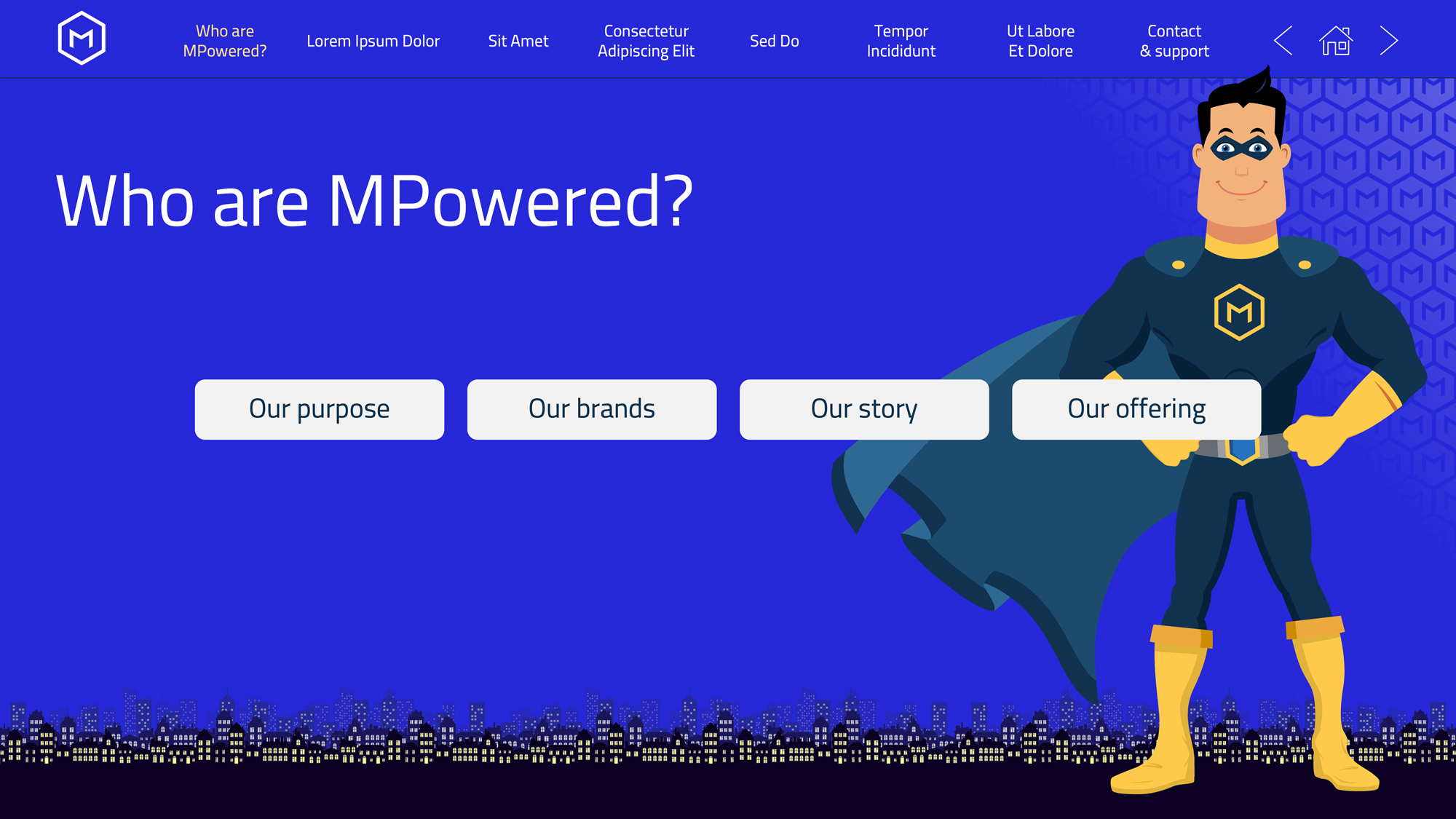
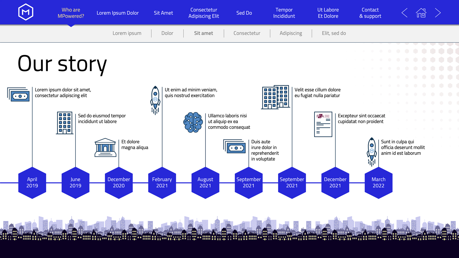
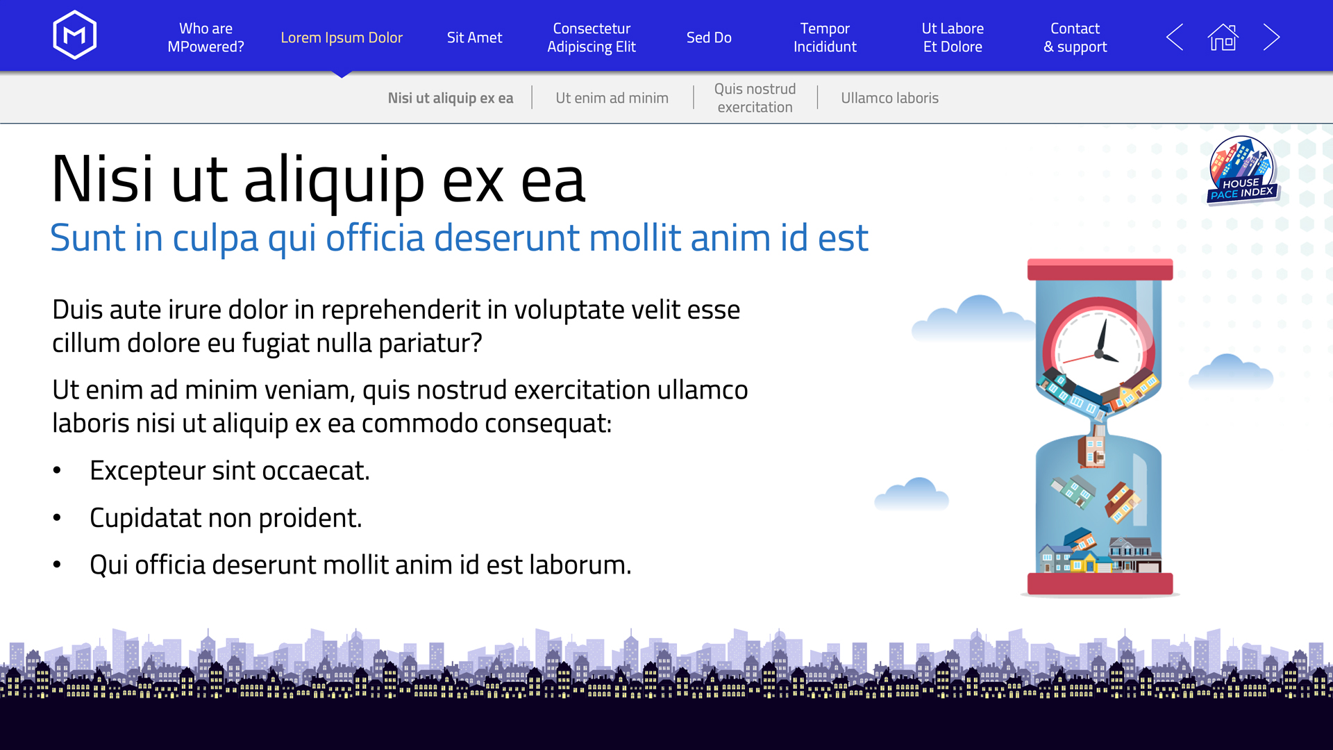
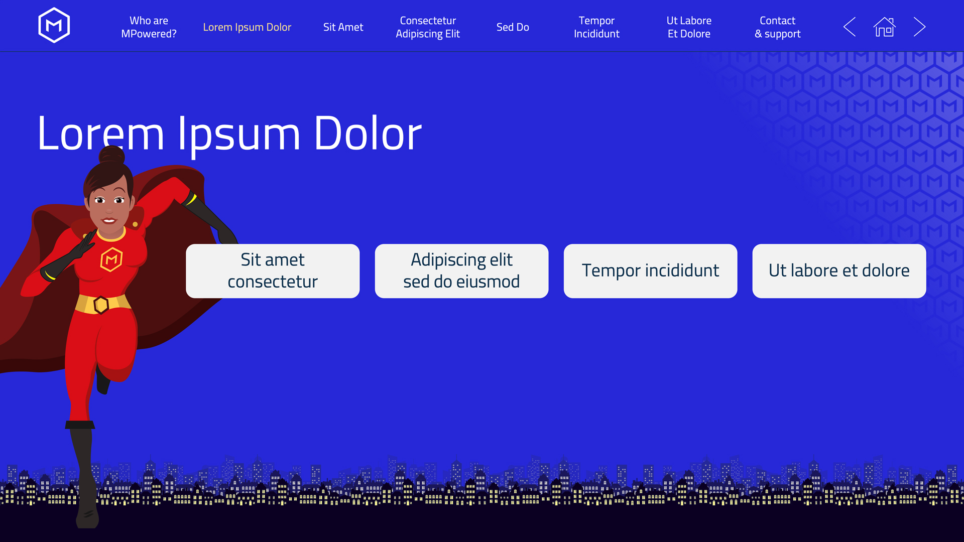
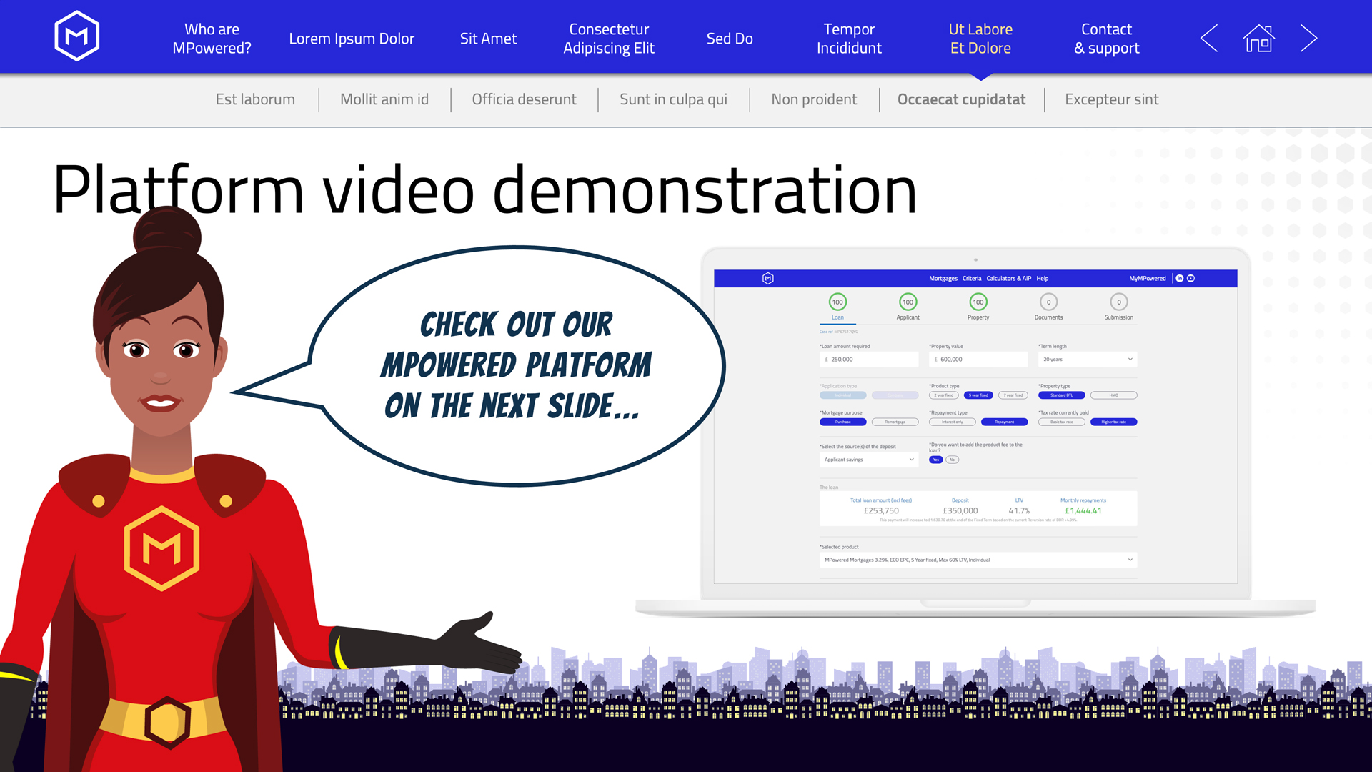
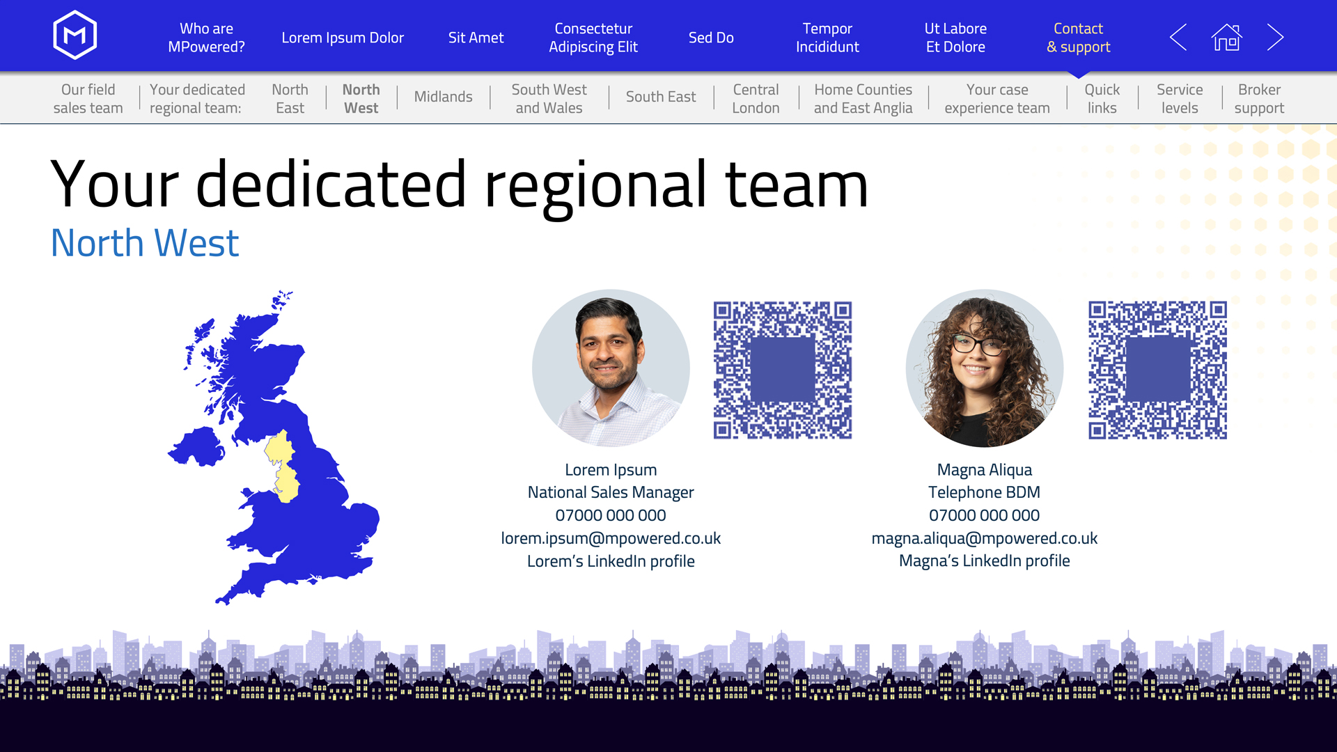
I worked with MQube and MPowered Mortgages to create their extensive 80-slide interactive sales presentation.

I devised a series of master templates to accomodate a main and sub navigation system, as per the clients’ request.

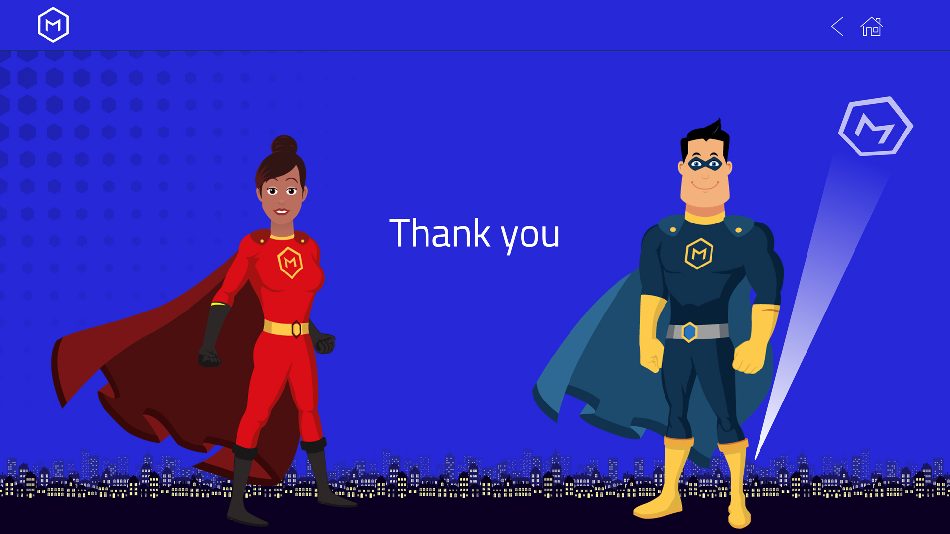
Using the in-house theme of superheroes and cityscapes, I upgraded the characters, created bespoke icons and illustrations, included video elements and introduced a series of brief but impactful animations to enhance the comic book motif.

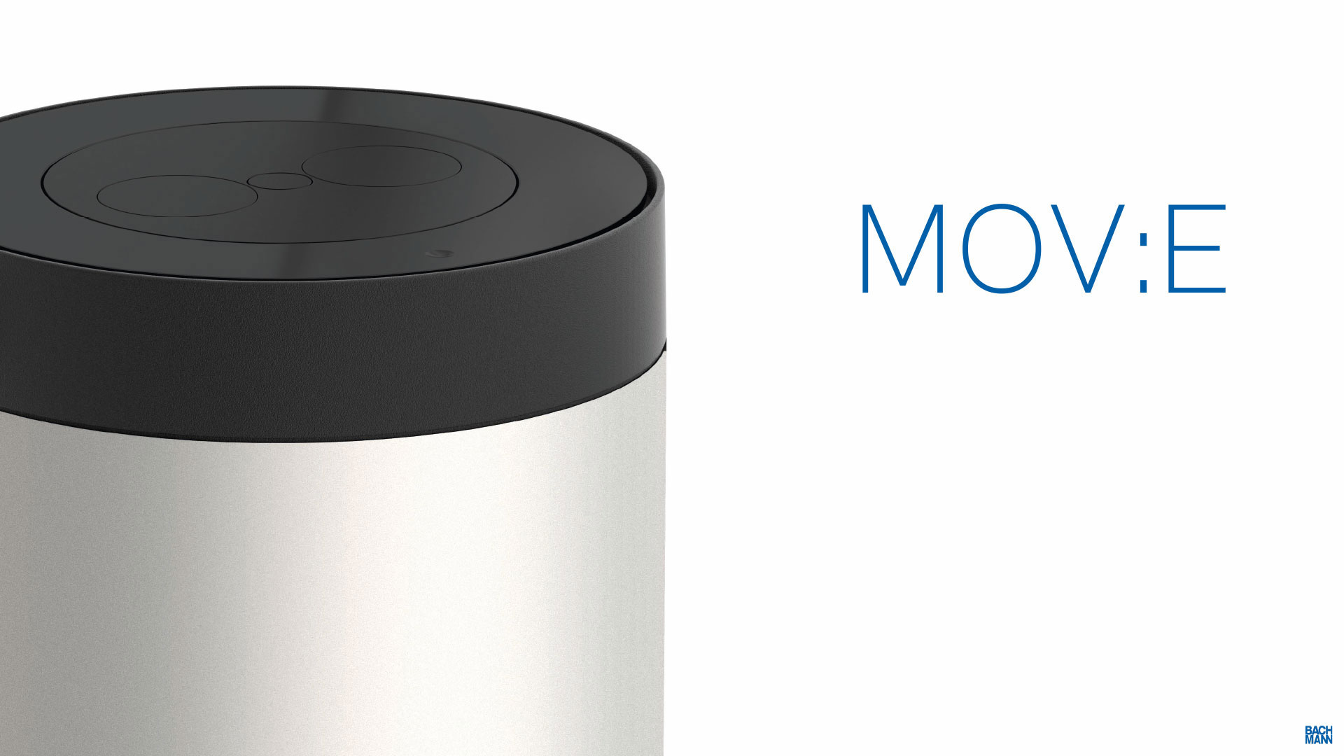
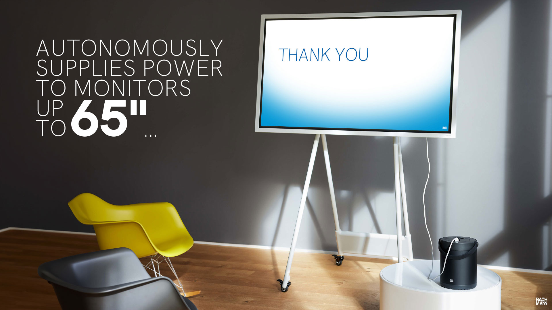
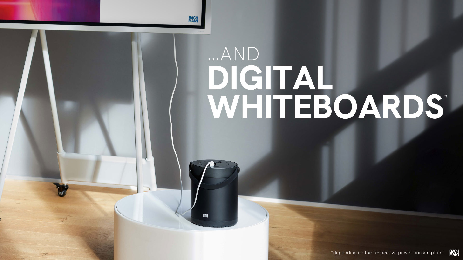
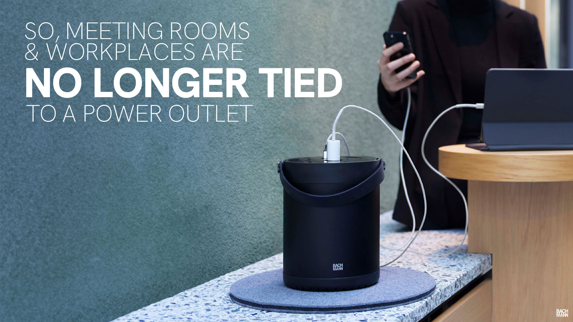
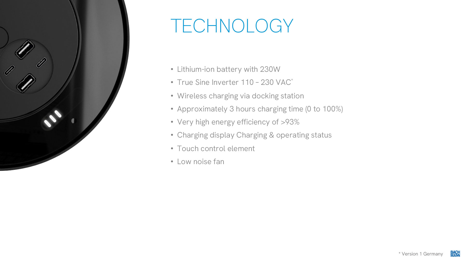
Bachmann

I was approached by electrical engineering company Bachmann to create a fresh, clean look for their series of direct-to-client presentations, which introduced the company and demonstrated many of their flagship products.

The aim was to produce punchy and attractive slides that let the products shine whilst not being overloaded with detail.

To do this, I advised on where it was advisable to combine or separate slides and helped to streamline the copy. I used a mix of client-supplied product shots, stock photography and Photoshop’s latest AI image generating capabilities.
Neuroverse

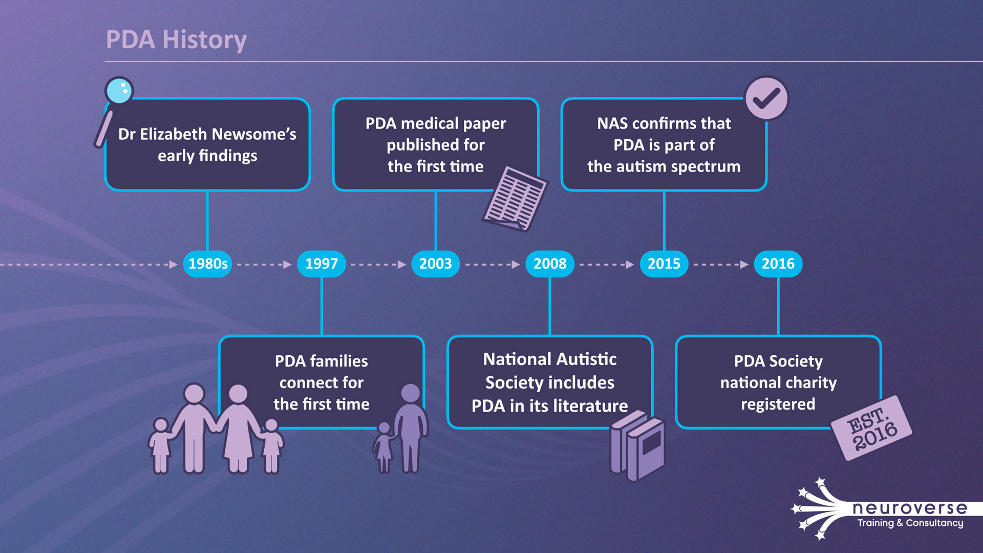
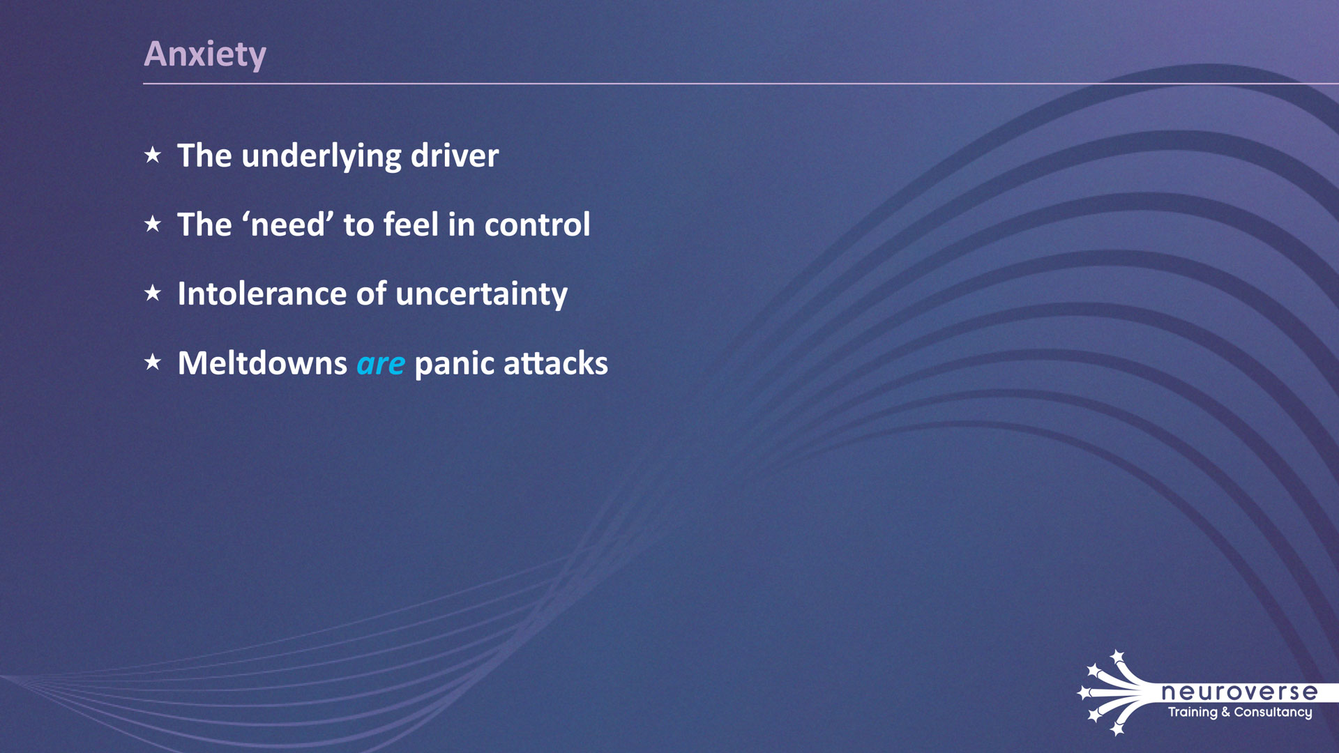
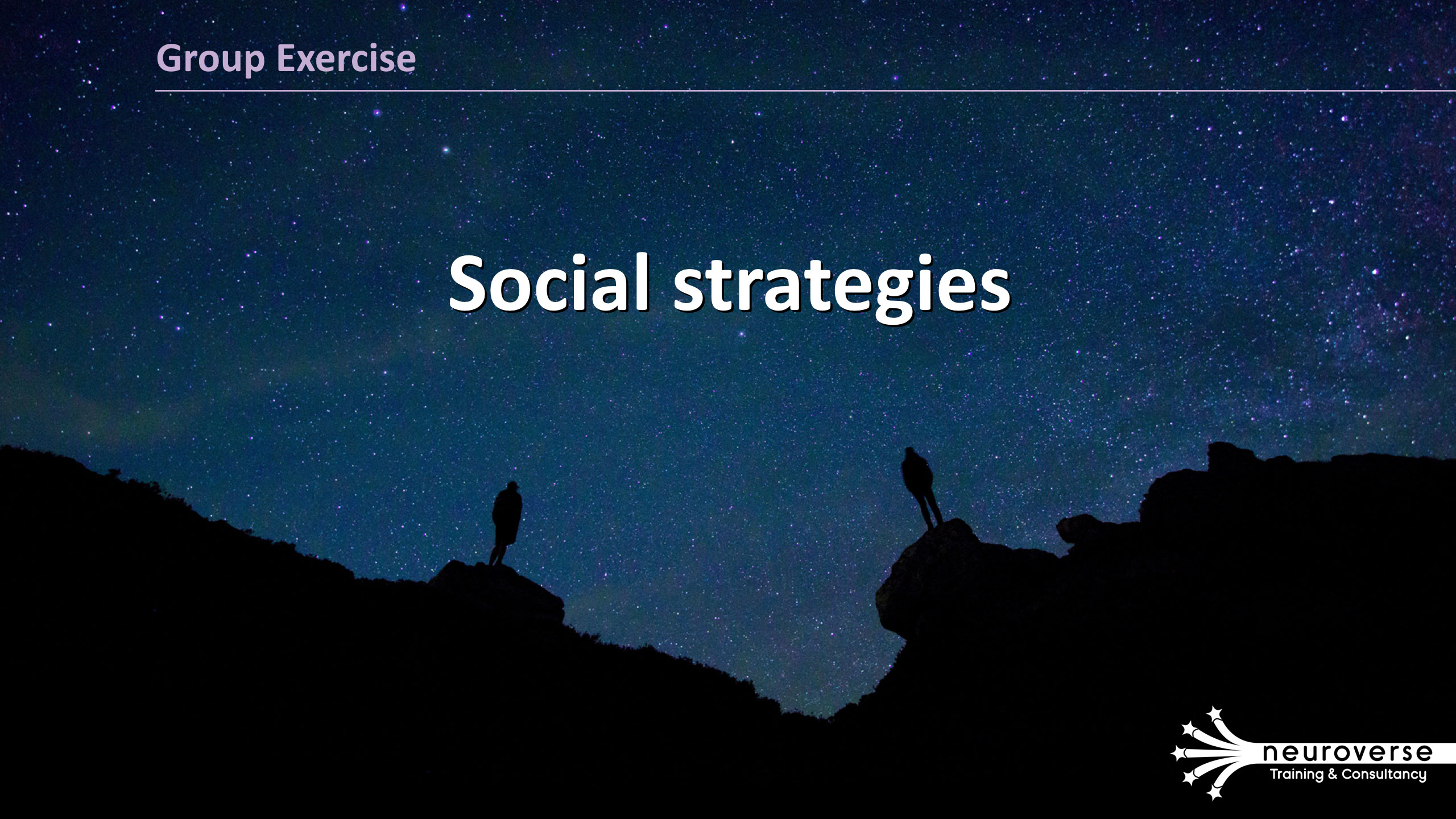
I was approached by autism educators Neuroverse to devise their new brand look and their training & consultancy presentation.

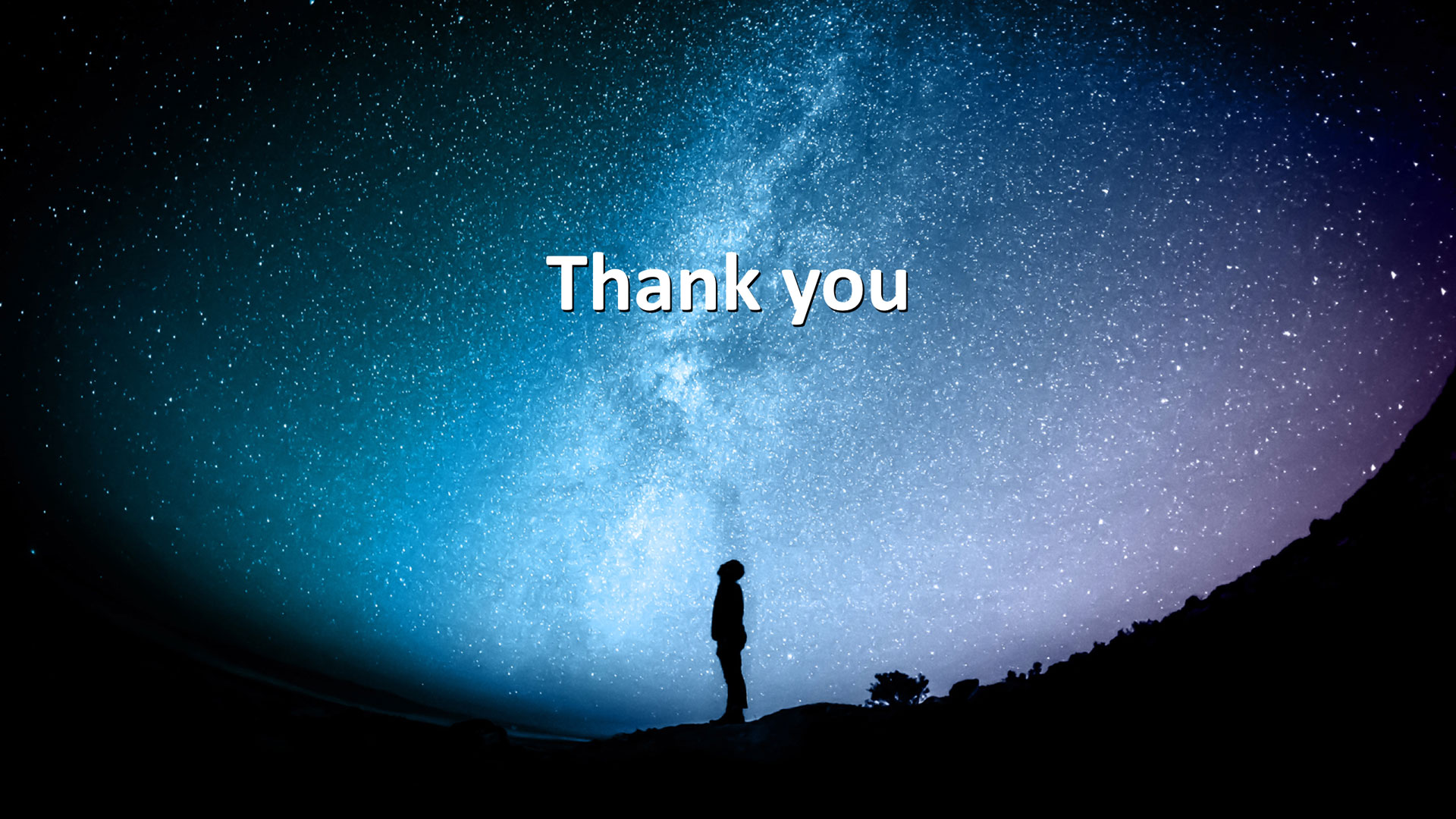
Working closely with the company manager I established a colour palette and produced a logo to signify an organisation that brings people together with education and understanding, and sought imagery to underline the company’s concept of likening neurology to a wide expanse of stars. Additionally, the silhouettes of people evoked a sense of both how solitary each autistic person (and each person trying to understand autistic people – the presentation’s audience) can feel, but also to celebrate the uniqueness of every individual.